Photo Editing Guide
Photo Editing Fundamentals: Start Simple
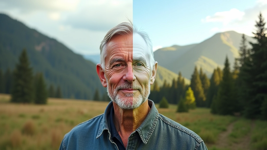
Brightness, contrast, saturation — these four adjustments solve most editing problems. We'll show you how to use them without overdoing it.
Why These Four Adjustments Matter
When you're starting out with photo editing, it's easy to get overwhelmed. There's brightness, exposure, levels, curves, vibrance, saturation, clarity, highlights, shadows... the list goes on. But here's the thing — you don't need all of them right away.
Most photos respond beautifully to just four adjustments. We're talking brightness, contrast, saturation, and temperature. That's it. Master these, and you'll solve about 80% of the editing challenges you'll encounter. The other stuff? It can wait.
The key is learning how to use them without making your images look over-processed. That's what separates a natural-looking edit from something that screams "I just discovered the saturation slider."

Brightness: The Foundation
Brightness is your starting point. It's literally making the entire image lighter or darker. Simple, right? But it's powerful because it sets the tone for everything else you'll do.
Here's where most people mess up — they push brightness too far. If you're increasing it, aim for subtle. We're talking maybe 15-25 points, not 50+. Your photo should look naturally lit, not like it's been bleached out.
A practical tip: check your shadows and highlights. If your shadows are getting too light and losing detail, you've probably gone too far. The best edits are ones where someone looks at your photo and thinks, "That's nice" — not "That's obviously edited."
Contrast: Adding Punch
Brightness makes things lighter. Contrast makes the difference between light and dark areas more pronounced. It's what makes your image pop without looking fake.
Start with +15 to +30. This is where you'll see the real improvement. The dark areas stay dark, the bright areas stay bright, but the separation between them becomes more defined. Your photo gets dimension.
The mistake? Cranking it to 50+ thinking your photo needs drama. It doesn't. A well-contrasted photo is balanced. You want viewers to see your subject clearly, not to be distracted by an artificially harsh image.
Pro tip: Adjust brightness first, then contrast. They work together. If your brightness is off, contrast won't fix it.

Saturation: Color Without Excess
Saturation controls how intense your colors are. A little boost makes your photo feel more alive. Too much and it looks like a cartoon.
The sweet spot? Usually +10 to +25. That's enough to bring out the colors in your scene without making reds look neon or greens look artificial. You want people to think, "That's how it looked" — not "Someone went crazy with saturation."
Here's something important — saturation isn't always the answer. Some photos look better slightly desaturated, especially portraits or moody landscapes. Don't boost saturation automatically. Look at your image first. Does it need more color intensity? If yes, add 15 points and stop. If it looks fine, leave it alone.
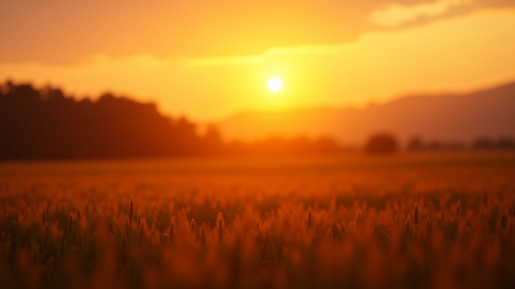
Temperature: The Finishing Touch
Temperature controls whether your image looks warm (orangey) or cool (bluish). It's the difference between a sunset photo that feels cozy and one that feels cold.
Most editing software shows this as a slider from blue to orange. Small adjustments make big differences here. We're talking +5 to +15 in most cases. A tiny shift warmer can make a landscape feel more inviting. A slight cool shift can make water look more refreshing.
This is where you add mood without being obvious about it. Your viewer won't consciously notice you've warmed the image slightly — they'll just feel like the photo makes them happy. That's the goal.
The Four-Step Edit
- Brightness: +15 to +25
- Contrast: +15 to +30
- Saturation: +10 to +25
- Temperature: +5 to +15 (or -5 to -15)
What You Should Know
Real advice from actual editing experience
Start With Raw
If possible, shoot in RAW format. It gives you way more flexibility with these adjustments. JPEGs work, but RAW files are more forgiving when you're learning.
Use Presets As Guides
Many editing apps have presets. They're good for getting ideas, but don't rely on them. Use a preset as a starting point, then tweak it. Your photo is unique.
Step Back Regularly
Every few adjustments, zoom out or view your image at full screen. It's easy to over-edit when you're zoomed in. What looks good close-up might look overdone from a distance.
Edit On Proper Lighting
Your editing space matters. Bright room, dim monitor, harsh sunlight? All of these affect how you perceive your edits. Consistent lighting helps you make better choices.
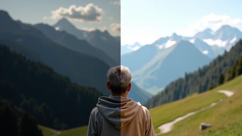
Before & After Comparison
Most software has a toggle between original and edited. Use it constantly. If the difference looks too extreme, you've probably overdone it.
Save Your Work
Keep the original. Always. Save your edits as a new file. You'll thank yourself when you want to try a different approach later.
The Real Secret
Here's what nobody tells you — the best edits are the subtle ones. You're not trying to transform a bad photo into a masterpiece. That's impossible. You're trying to make a good photo look its best.
These four adjustments are tools. They're not magic. Use them thoughtfully. Sometimes your photo only needs brightness. Sometimes it needs just a touch of saturation. Sometimes it needs nothing at all.
The more you edit, the better you'll get at knowing when to stop. You'll develop an eye for it. That takes time. Don't rush it. Edit slowly, compare often, and trust your instincts. That's how you'll develop your own style.
"The best editing looks like no editing at all. If someone looks at your photo and thinks about the editing instead of the subject, you've lost them."

A Note About This Guide
This guide is intended as educational information to help you understand basic photo editing principles. The specific adjustment values mentioned (brightness +15 to +25, contrast +15 to +30, etc.) are general recommendations and will vary depending on your specific image, software, and personal preferences. Every photo is different. Results depend on your starting image, lighting conditions, camera settings, and the editing software you're using. The best approach is to experiment with your own photos and develop your own understanding of what works. This isn't a prescription — it's a starting framework.